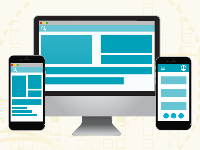
In the ever-evolving landscape of technology, the distinction between mobile apps and desktop software has become increasingly significant for developers, designers, and end-users alike. While both platforms aim to deliver efficient, user-friendly experiences, the underlying design principles guiding their development are markedly different.
This divergence stems from the inherent differences in hardware capabilities, user interaction methods, and typical usage scenarios. Understanding these differences is crucial for anyone involved in creating or utilizing digital tools, whether for personal use, business applications, or software development.
In this blog, we delve into a concise comparison of the design principles governing mobile apps and desktop software, shedding light on the unique challenges and opportunities each platform presents.
The Design Principles: A Comparative Overview
The world of digital design is vast and varied, with each platform bringing its own set of rules and best practices. Here, we present a succinct comparison of key design aspects for mobile apps and desktop software:
| Aspect | Mobile Apps | Desktop Software |
|---|---|---|
| Screen Size | Smaller screens, requiring more efficient use of space. | Larger screens, allowing for more content and complex layouts. |
| User Interaction | Touch-based interactions (taps, swipes, pinches). | Mouse and keyboard interactions. |
| Portability | Designed for use on the go, often in varying environments. | Primarily used in stationary settings like offices or homes. |
| Connectivity | Often rely on mobile data; should be efficient with data usage. | Typically used with stable internet connections; less focus on data efficiency. |
| Battery Life | Optimized for battery efficiency due to limited battery life. | Less concern for power consumption as they are often plugged in. |
| Performance | Limited by mobile hardware; emphasis on lightweight and efficient design. | More powerful hardware allows for more resource-intensive applications. |
| User Interface | Simplified and minimalistic to accommodate smaller screens and touch controls. | Can afford to be more complex due to larger screen and precise control methods. |
| Notifications | Push notifications are a key feature for real-time updates. | Less emphasis on real-time notifications; more focus on in-app updates. |
| Context of Use | Used in a variety of settings and situations, often for shorter durations. | Used in more predictable settings, typically for longer periods of focused work. |
| Accessibility | Essential to consider varying levels of mobility and environment adaptability. | More focus on customization and adaptability to different user needs. |
| Updates and Maintenance | Frequent updates are common, often managed through app stores. | Updates can be less frequent, with more emphasis on major releases. |
The Implications of Design Differences
The table above not only highlights the differences in design principles but also reflects the distinct user expectations and experiences on each platform. Mobile apps, with their emphasis on touch interaction and portability, cater to users seeking quick, efficient, and on-the-go interactions. Desktop software, on the other hand, offers a more stable and comprehensive experience, suitable for prolonged use and complex tasks.
Adapting to User Needs
The key to successful design in both realms lies in understanding and adapting to user needs. For mobile apps, this means creating intuitive, touch-friendly interfaces that are easy to navigate even on the smallest screens. For desktop software, it involves leveraging the power of more robust hardware to deliver feature-rich applications that can handle complex tasks with ease.
Conclusion
The comparison between mobile apps and desktop software design principles underscores the importance of context in technology design. While both platforms share the common goal of providing an effective user experience, the path to achieving this varies significantly.
Mobile apps prioritize portability, touch-based interaction, and efficiency, reflecting the on-the-go nature of their use. In contrast, desktop software leverages the advantages of larger screens, stable connectivity, and more robust hardware to offer complex functionalities and a more extensive user interface.
As technology continues to advance, these design principles will undoubtedly evolve, but the core considerations of user context and device capabilities will remain central to creating successful digital solutions. Whether you’re a developer, designer, or simply a tech enthusiast, understanding these principles is key to appreciating and leveraging the strengths of each platform.

